
Sep 5, 2023
Netflix : Design Analysis
Being a 90s kid, I have observed and experienced technology change around me multifolds. The experience of watching movies and TV series has evolved from cable TV to purchasing DVDs to CDs to downloading them through torrent to youtube and now to subscription based streaming platforms. For this Design analysis , I want to discuss Netflix as a product example of good design.
It’s quite interesting to note how Netflix started out in the year 1997 as a service that sold and rented DVDs, and later transformed into an OTT streaming platform — trusted & loved by millions of users. Netflix is a subscription based online streaming platform that provides the user the ability to watch movies, TV series and Documentaries. The system allows the user to take a monthly subscription for either basic, standard or premium service depending on the video quality and number of screens. What I really like about Netflix is the personalization that it allows me to do, starting at the landing screen itself, it lets me set a profile with an icon and name. Other than that there is a profile to select for kids, that provides content specially curated for them. The overall theme of keeping a black background without it becoming daunting and a red logo on the left top makes the design impactful and readable (Fig1.1).
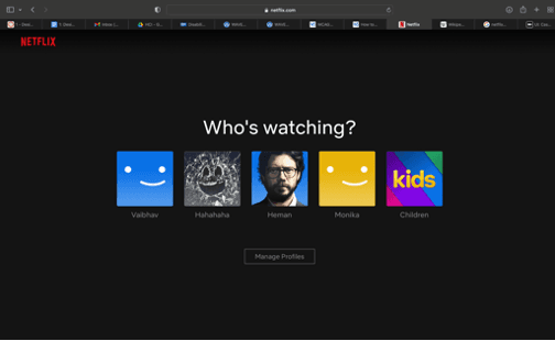
Figure1.1 Landing page
As soon as I enter my profile- Home screen, There is a crisp written menu on the left that gives me a variety of options to choose from. Whereas on the right there is a search bar, notification icon for the latest updates, personal profile (Fig1.2).
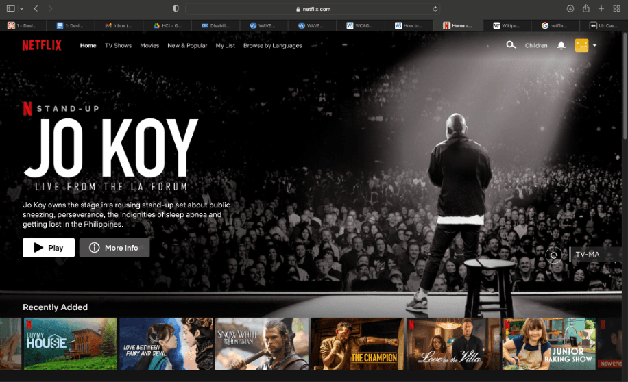
Figure1.2 Home Screen
The UI of the home screen is so well designed that even though there is a lot of content on Netflix to choose from, they have managed to design it so well that it’s not at all overwhelming for the users and we are able to navigate through it easily. This aspect of UI design keeps in mind the primary activity — that a user is here to relax and watch something good. Hence, it’s designed so that the user is not burdened with unnecessary cognitive load.
I feel the background being black allows the content to pop out and make it easy for the user to navigate. The careful layout of adding the horizontal sections along with images and text on top is clever (Fig 1.3) -
Recently Added
Continue watching for the user
Trending now
Popular on netflixTop 10 movies
Top picks for the User (giving the feeling of user first)
And many other options make it extremely user centric. It’s designed in a format that organizes content in a grid with optimum spacing — easy to read.
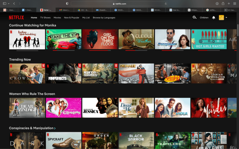
Figure1.3 Horizontal sections
The TV shows menu is especially my favorite as it allows me to filter through content on the basis of genre (Fig 2.1). This flexibility of choosing through content really makes the user feel that the platform wants to serve them better by providing quality choices.
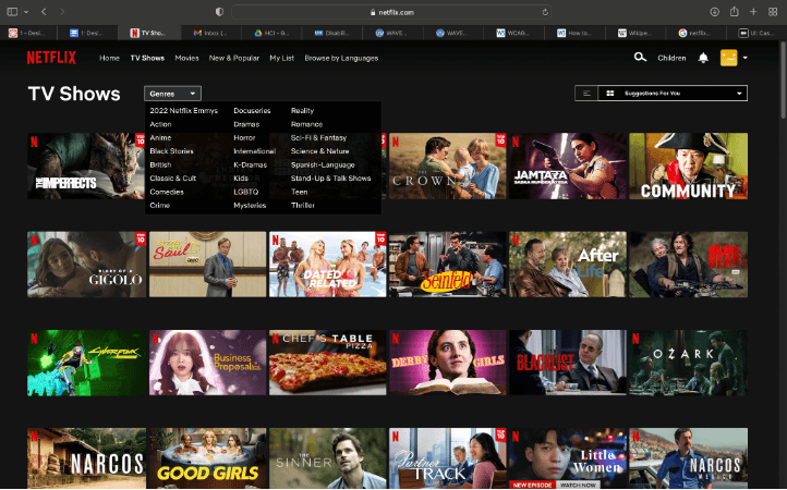
Figure2.1 Sorting made easy
When I hover over a TV show/ Movie I like, the platform plays the trailer/gives me a glimpse — without having me open it in a new tab. There are 3 options — I can start playing it , add it to my list, simply give a thumbs up (Fig 2.2). If I decide to go ahead and press the down button, it enlarges the selection to choose between seasons and episodes (Fig 2.3). Giving so many options to users, without having them move to a new window and without feeling them overwhelmed is a really good experience design.
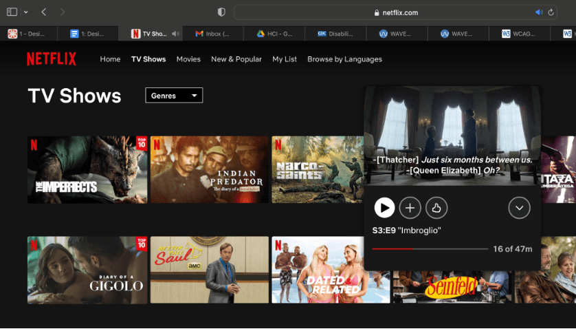
Figure 2.2 — Catching glimpse
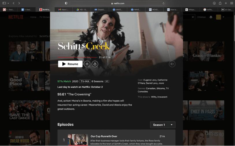
Figure 2.3 — Enlarging the content
Once I start watching the content, the streaming option is quite seamless and supportive of users’ needs. The icons are simple, readable, size appropriate. The slider bar to watch the content at a particular time is easy to operate, there is an option to change the language, enable the subtitles, and change playback speed. The streaming options provided are quite apt and lets the user enjoy the content with full product support.
The system is very well designed keeping in mind usability and usefulness. It fulfills its purpose of being a streaming platform, providing immersive content without the UI of the system becoming overwhelming. The emotional impact that the system has is its ability to provide personalization options. The My list option allows the user to curate and add various content as per their liking to the list and watch it later (Fig 3.1). The only modification that I would suggest to My List is if the system would sort the content on the basis of genre, it would be easier to navigate.
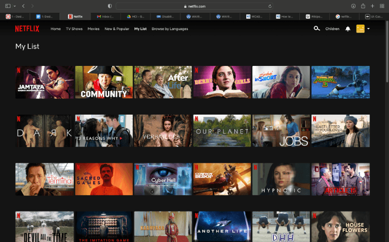
Figure 3.1 — My list screen
The overall design and feel of the product is quite supreme and full of quality. Even though there are a plethora of streaming platforms like Amazon prime, Disney hotstar, the UIUX design of Netflix always stands out to me. The quality of content also plays a major role in the consumer based systems and Netflix has tried to capture it by having in-house produced content. Another feature that they’ve added to their design recently is the ‘New & popular section’ where it entices the users by showing the upcoming content (Fig 4.1), which I feel is a good business strategy.

Figure 4.1 — New & Popular
Netflix has transformed the user experience of watching movies and TV series. If you play something on the Netflix app on a smart TV, it gives the user a feeling as if they were watching it in a cinema hall, which is quite interesting. Overall, I believe it’s a good example of User interface and experience design.